
User Types: The Tourists and The Explorers
User research is paramount to a well-balanced design process. It helps us create and implement interfaces that adhere to the needs and expectations of our users. But how do we adjust for different behavioral patterns amongst that group?
People tend to fall into one of two categories – thinkers and doers; cautious and impulsive; perceptive and decisive. Neither of the two is ‘better’ than the other, but they absolutely are distinct.
In a past life, I was a multi-day raft guide on the Colorado River. Almost all of the people on my trips fell into one of these two groups. Some of my passengers wanted a controlled experience. They wanted to know where we were stopping every day, which rapids we were hitting, what we were serving for each meal, and detailed information about all aspects of the canyon itself. Other people wanted a more adventurous trip. They tended to be the ones who wanted to try and row my boat, who ran up the side hikes in front of the guide without waiting for interp, who came prepared with a swath of information that they had looked up, and who wanted to define their experience for themselves.
These two types of visitors, both unique in their own right, also shared many things in common. Namely, they still required a guide to get them down the river. They still needed assistance, but they looked for it differently. The latter group would ask which way to go and then take off to explore independently, while the former stuck close to the guide for step-by-step instruction. But they were on the same journey.
I refer to these two groups as the tourists and the explorers, respectively, and they did not leave those distinctions behind when they left the trip.
Like my passengers, your users will generally separate into these two groups. One will look for detailed walkthroughs and guidelines while the other will jump right into the interface and start playing around. However, both require a clear and intuitive interface with useful navigation and action-oriented user flows. That’s the common denominator.
Disclaimer: For this discussion, I am going to focus on complex sites and apps, as opposed to more simple, static websites. The distinction between these two groups becomes more important when dealing with interaction-heavy interfaces. Simple websites tend to rely more on static content than complex interactions, and therefore behavioral distinctions tend not to be as dominant.
The Tourist
Ok, get rid of the image in your head of the middle-aged heavy weight with the fanny pack and sun visor. These users may be just as savvy and informed as their counterparts. They tend to be the people who are more motivated by short-term goals than by discovery, and they read the directions before they start to assemble an IKEA desk.
When considering this type of visitor during my planning stages, I always start with the ground level: the new user. Tourists benefit from a detailed onboarding process that may include a walkthrough or tutorial. (Remember, though, that your other set of users may not want to sit through a lengthy tutorial, so consider making it brief and dismissible.)
Now that they have landed at a starting point, I start to address this user group (new and established) as a whole. Strong verbal and visual cues help them advance through the interface. I focus on creating goal-oriented user flows. For static content, clear pagination, breadcrumbs, and navigation provide a tangible cue to their progress, placement, and destination. For interactive active content, such as within HackerRank, I provide progress indicators, statistics, and goalpoints to motivate progression through the site’s content. Tourists do not always need, nor want their hand held, but they do rely on in-app education to keep them engaged.
Whether it is explicit step-by-step instructions or some subtle interface interaction that reveals more functionality, the fastest way to engage users and provide a clear path to rapid adoption is to build education right into your product from the start.
The Explorer
This rogue individual is the ‘learn by doing’ type. She is driven by curiosity and logic – her lego creations rarely looked exactly like the image on the box. Unfortunately, the mentality of flying by the seat of ones pants can lead to frustration upon reaching a dead end. When that happens, these users will look for clear, concise navigational cues to get them back on the road to discovery, or else they will go walking.
I actually find that this is the easier of the two groups to design for. Tourists require a delicate balance of useful information that doesn’t become officious or redundant. Explorers, on the other hand, tend to rely on their own devices to learn the interface, discover its content, and trouble shoot problems.
It’s important to include useful cues to help explorers pick up new trails through the site’s content and familiarize themselves with the actions that are available to them. Joshua Brewer refers to these as orientation, route decision, route monitoring and destination recognition, four cues that help a user determine where they are, where they want to be, and how to get there. Strong navigation, in the form of prominent headers and footers, as well as breadcrumbs and internal links, can aid an exploratory user in finding and staying on a path.
These users tend to be curious, so encourage their discovery with suggestions and relevant actions. Popular post sections, or related content areas will drive them further into the architecture. At HackerRank, we show detailed statistics and leaderboards to encourage users to try new challenges and refine existing code in order to advance beyond their peers. These users respond to strong feed back loops, but be wary of flows that are redundant or lead to dead ends.
The Guide
You, the designer, are your users’ guide. It’s easy to pinpoint the similarities between these two user groups. Both require useful navigation to orientate them and to direct them to the next step. Like my raft passengers, the tourist will likely follow the navigation closely in order to stay on track; the explorer will check in from time to time and use the navigation to figure out where to go next. Both sets of users require interesting content, although the tourist requires smaller, short-term chunks of information while the explorer merely requires that one chunk is just as captivating as the next in order to keep them discovering.
So how can you create interactions that appeal to both?
In an ecommerce shop…
Create a clear and cohesive navigation and let tourists view collections and browse by specific category. Recommendations, sales, look books, and related items can grab an explorer’s attention for hours.
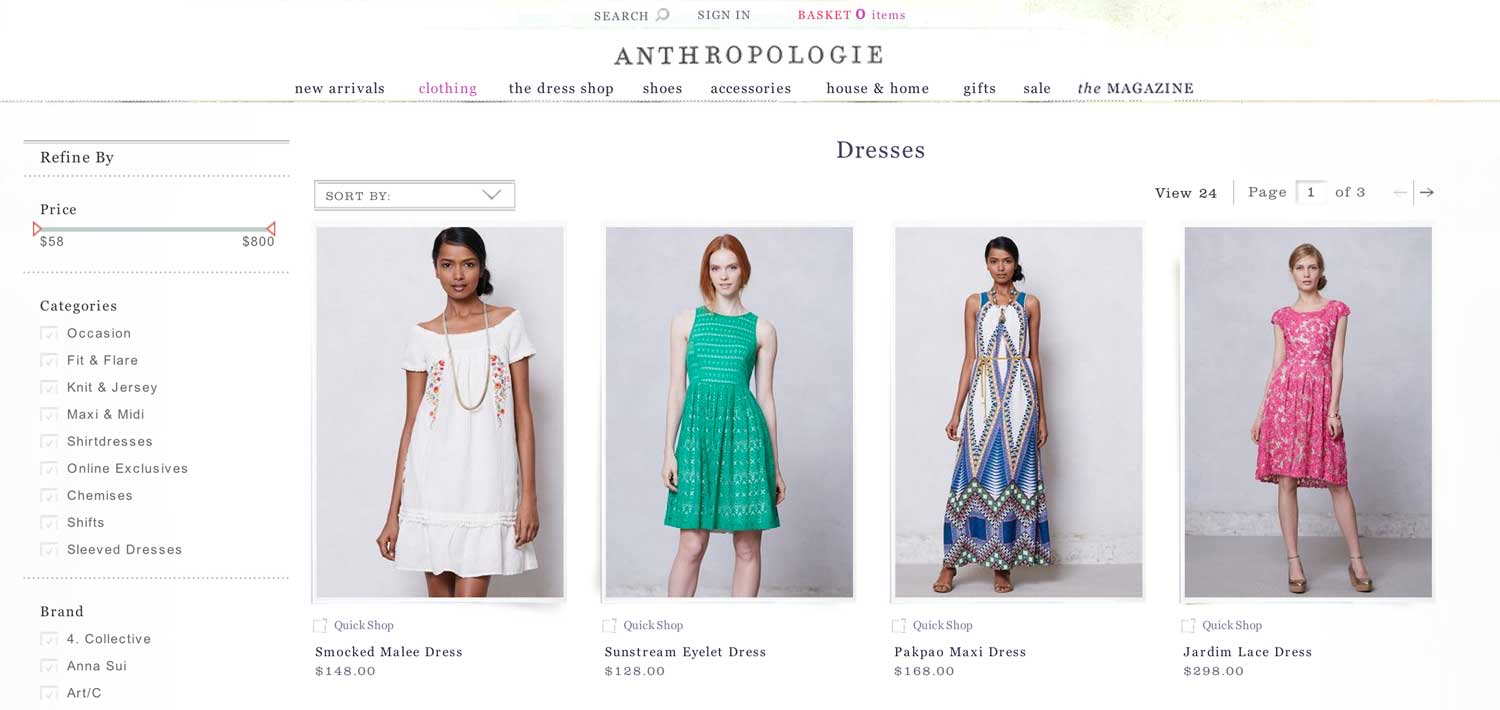
Anthropologie offers clear navigation by category to tourists, but includes plenty of hooks for explorers, such as browsing by outfit or price.
In applications…
Feature short term goals and communicative navigation for tourists, while helping explorers find new routes to content that relate to their behavior or interests.
On news sites or large blogs…
Provide pagination, categorization, and archives to help tourists find clear paths through the site’s information. Catch curious explorers with strong internal links and links to featured, recommended, and popular content.
Obviously not every person will fit exactly into either of these groups. However, they provide solid guidelines when considering user behaviors as you design your interface. Only by understanding what a person expects, and empathizing with what a person requires can we, as designers, create a balanced, full experience for our users.